Fixters Website Renovation
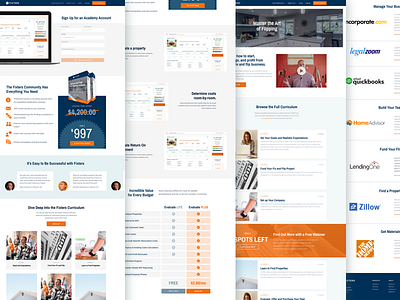
Just finished renovating the Fixters house-flipping startup website.
Their color palette and typography were really lacking, so I pumped the hue of the orange, introduced a couple of subtle shades to break up sections, and revamped their usage of Montserrat and Archivo Narrow.
More by Daniel R Farrell View profile
Like
