Sherwin-Williams Rebrand — Brand Guidelines
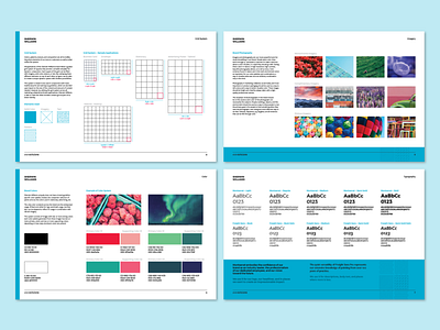
A few of the pages from my Sherwin-Williams rebrand guidelines. This includes content grid suggestions, imagery styles recommendations, color compositions, and typography outlines.
This is one of the first times I've worked on defining a comprehensive (albeit simple) brand guideline, diving deep into defining the nitty gritty details of how certain future applications could be made. It was pretty fun establishing these rules by thinking about what could be done by other designers with them, as opposed to strictly what I myself would be creating.
More by Justin McKissick View profile
Like
