Jimu Logo

// Design ideas
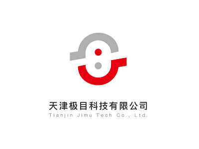
The letter "J", Chinese character "mu", and eyes are used as the main visual point of the logo to extend the design. Refer to the Tai Chi Pisces diagram elements. The combination of positive and negative shapes reinforces the brand recognition. Red and gray are used as the color combinations. Red represents Vigorous, radical, and authoritative, while grey has advanced, technologically-sensed, and other color languages, further enhancing brand identity.