TV Ratings
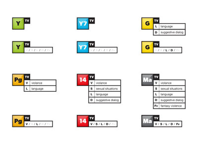
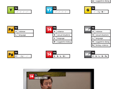
As designers, we are suppose to be problems solvers. So while watching TV the other day, I noticed how un-informational and horribly designed the TV ratings system was. The rating would come up in the beginning of the show with descriptions of the rating. After each commercial break, it would be the truncated version.
So instead of putting up a polished already approved logo. Thought I would post an idea. Please feel free to come up with a better one. Too much talk, sorry.
More by Chris Streger View profile
Like

