Reteam branding
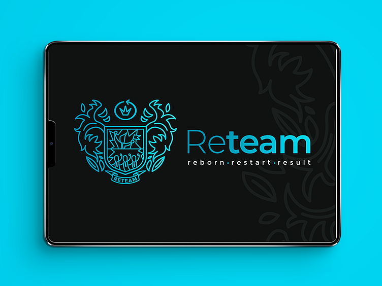
Logotype and branding for team of young businessmen. it was very imortant for client to show how serious and skilled his company is. He likes heraldic logotypes and classic style. But also this is team of young and ambitious people with their own sense of humour.
So, I decided to combine heraldic style, comic and flat. If you zoom in the emblem, you can see a little comic on the shield. Do you remember "Who we are?" meme? It's a reference to this famous meme. But with businessmen. So, this comics got another sense: these people really know what they want from life.
- Who we are? - Reteam! - What do we do? - Successful business!
Interesting project details, identity and polygraphy examples with presentation here