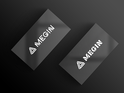
Megin - logo for racing cloathing
Client came to us with request of "completing" his idea of the logo. It was basic (overused) geometric symbol and 2 ornamental typefaces.
In order to achieve perfect function of this logo in patching and in small size, I had to recreate both symbol and logotypes.
I have found the symbol online (yea, generic) and recreader it with thicker lines and bigger gaps.
-
Like what you see?
More by Andrej designSats View profile
Like
