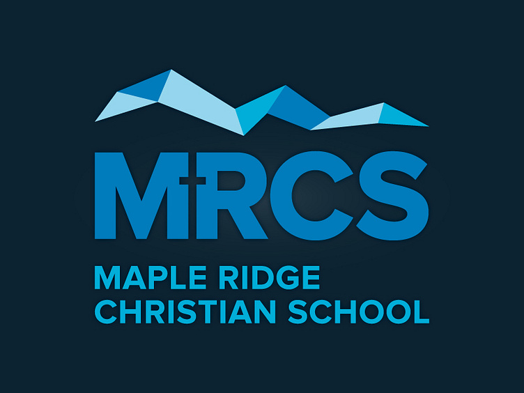
Maple Ridge Christian School Logo Refresh
A branding update to a local Christian School. Updated the typography in the word mark and created a more modern approach to the brand mark on the top.
The refresh is loosely inspired by the Golden Ears mountain line, with a modern look and style, and the coloured bars represent people and community uniting to form a strong connection.
More by Jess Gleason View profile
Like
