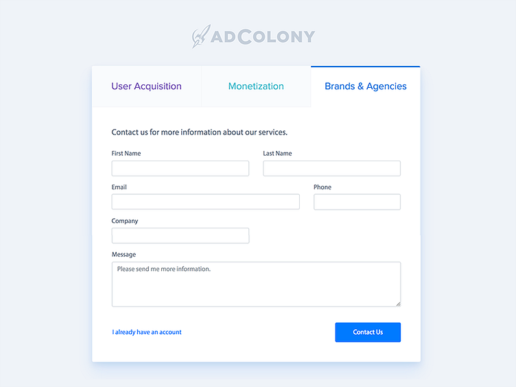
AdColony - Registration
This AdColony registration screen contains a lot of form fields that I had to include, so I tried to distract the user with some colorful and on-brand tabs at the top.
I decided to keep the fields stacked horizontally to keep the form below a certain height. I'd love to go back and build a registration flow that contains multiple steps instead of a large form, but I also want to sleep and spend time with my cat.
More by Maxime Preaux View profile
Like
