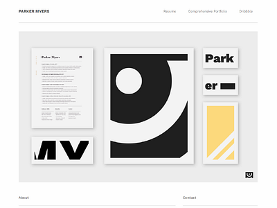
WEB002 - Homepage Mockup
I needed some kind of visual interest on my homepage that still fit the very bare-bones aesthetic I was going for, and I think this did a good job of working both jobs.
As always - www.parkermyers.com
And also - I hate how Windows renders fonts.
More by Parker Myers View profile
Like
