Ambrosia Olive Oil
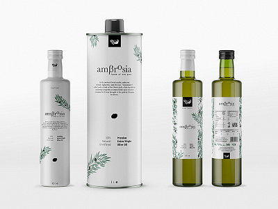
The Brief: Ambrosia is a Sydney based company that imports greek olive oil & quality greek products. We've been asked to create a logotype and the product identity for their EVO & Premium EVO, they wanted to reflect the simplicity of everyday life of the Greek countryside.
The Design: The symbol is based on the myth that "ambrosia" - the food o the gods - was brought to mount Olympus by doves. We designed a dove with simple round forms that carrys a branch of olive tree - connecting the food of the gods with the olive products. The logotype with classic and simple typography, supports the symbol with circular forms and adding a greek identity with the greek letter β (beta) in the place of b. The product identity is based on a simplified illustration of an olive tree branch. Simpler layout, cleaner forms and smaller amount of branches for the Premium EVO and a more common approach for the EVO label is meant to show the difference of two products, in quality and difficulty of production.
