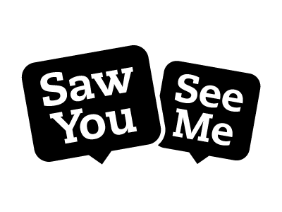
SawYouSeeMe identity v2
I've received lots of useful feedback on the previous version of this logo here, from my studiomate and on humhum and have tried to resolve some of the main comments with this version.
I've been wanting to create a single colour version that worked and still hinted at the shyness that the "See Me" speech bubble is meant to evoke. I reckon that this is an improvement...
More by Adam Kemeny View profile
Like

