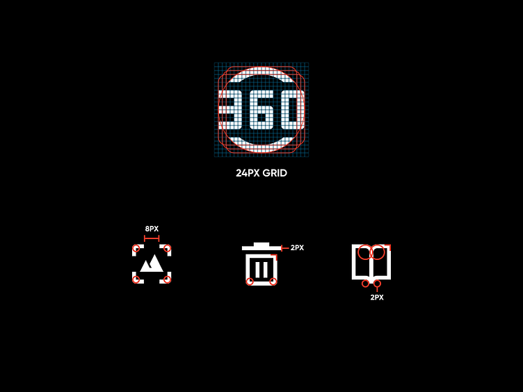
Insta360 Icon Grid
Based on our earlier 24*24 pixel grid system, together with the new icon drawing method, the basic consistency of the visually maintained size of all icons is fully guaranteed. Prior to this, due to the superposition of various complex functions and the time constraints of the project, resulting in confusion of icon style and visual size, as well as directly affecting the user's experience for the entire App, this had to make us ponder and make this possible. The redesign of the secondary icon can be performed smoothly. Thanks @illusate
基于我们早期 24*24 像素的栅格系统,配合新的图标绘制方法,充分保障了所有图标的能够在视觉上保持大小的基本一致。 在这之前,由于各种复杂功能的叠加,和项目的时间紧迫,造成图标风格、视觉大小上的混乱,以至于直接影响到用户对于整个 App 的体验,这不得不让我们深思,也使得这次图标的重新设计能够顺利进行~感谢 @illusate 的建议
More by Wongbo View profile
Like
