Music App Dribble
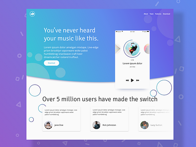
Here's a concept for a music app I worked on recently. The concept is based around other streaming based services such as Spotify and Tidal.
The concept here is focused around a landing page which features a brief showcase of the Music Player's app UI, followed by some user testimonials which can be searched through using simple swipe gestures left and right.
For branding I went for a brighter color palette, similar to Apple Music, of light blues and violets. I also wanted to steer clear of the darker tones I've seen on other apps as it was not reflective of the more fun playful theme I was going for.
To accentuate the more playful and light nature of the landing page, I chose to use bubbles which I've used in similar projects in the past to give more of a floating feel to the screen.
If you're interested in seeing some more of my thinking, and the wireframing behind this app concept, be sure to check out the post I made for it on my Instagram
Be sure to follow me on Social Media:
Instagram | Behance | Medium

