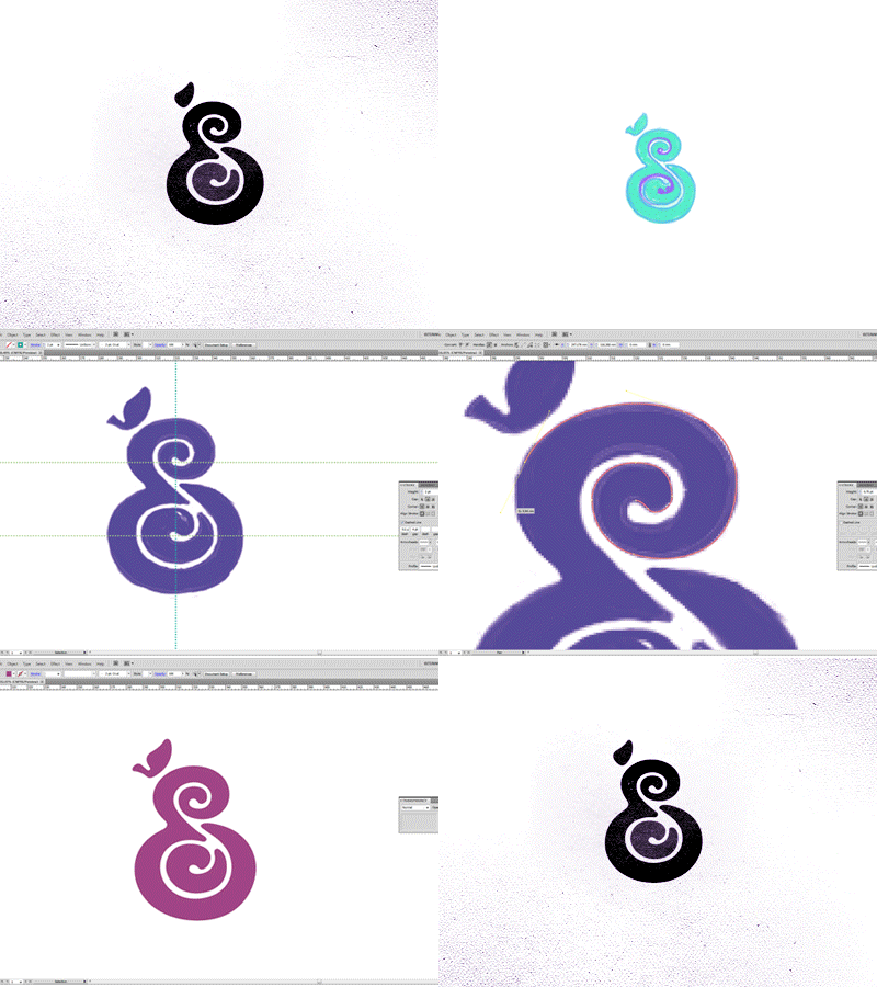
E/S Nutrition Logo/Mark
Concept behind this logo is very simple, I developed a fruit to represent a straightforward and clear idea of nutrition. The fruit is also formed by the initials of the Nutritionist name, 'E' on the outside and an 'S' in the center. The 'S' sounds a little like a seed sprouting, it has much to do with the Functional Nutrition is the branch of activity of Emanuelle, she analyze the process of a holistic way and focusing on the 'origin' of the unbalance, so this 'inner' fell is good. A big advantage of this symbol application is that depending on the color you have different fruits. :)
Hope you enjoy, every suggestion and comment is welcome!
More by Breno Bitencourt View profile
Services by Breno Bitencourt
Like
