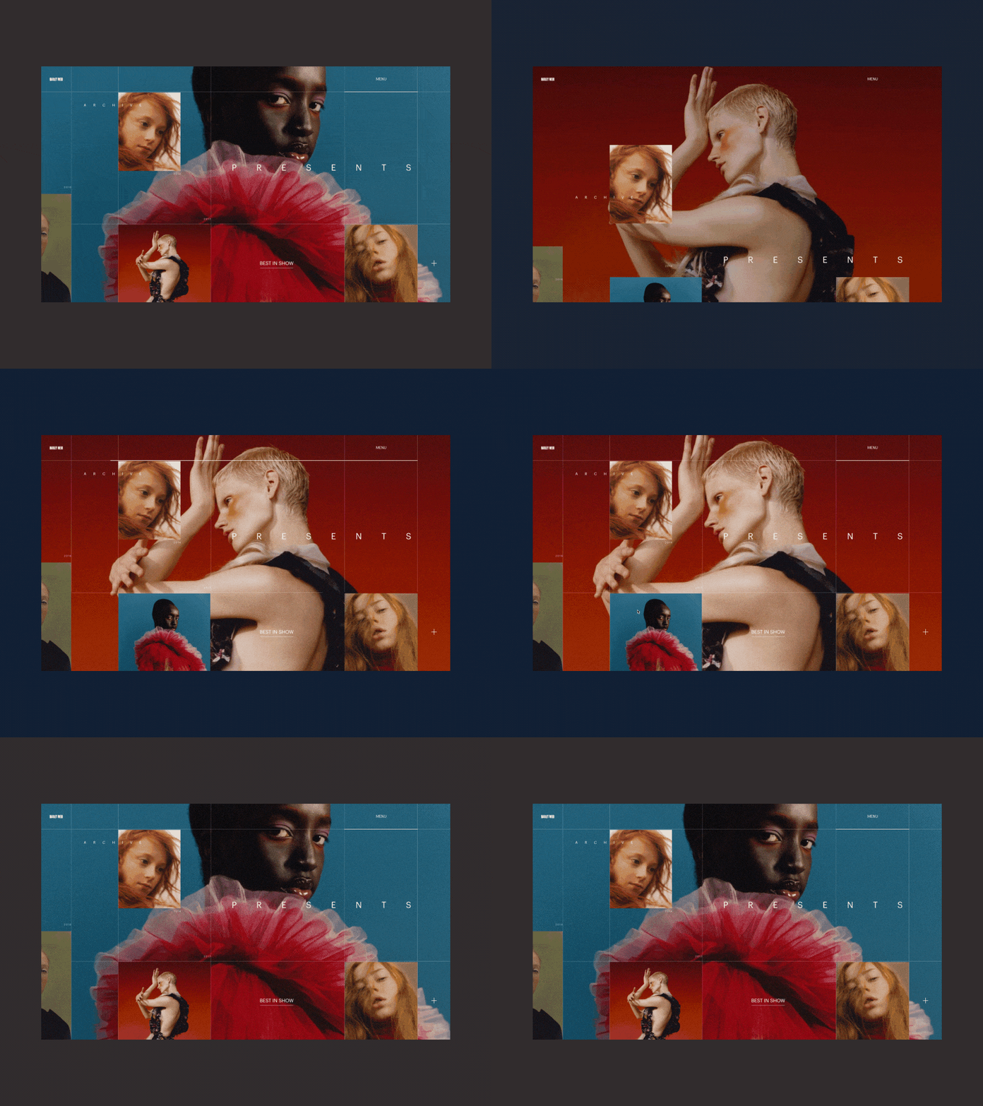
Harley Weir Personal Promo Website Animation Second Version
Hey,
This is the second version of the homepage of a personal website for an award-winning photographer. As you might have noticed, I am playing with the nonstandard grid, whitespace and general geometry of the layout. The key conceptual idea behind this homepage is that by clicking on any of the pictures from the grid visitors will see it in full. I am also keen on keeping the possibility of re-arranging the photo grid the way you like to increase their engagement.
How do you like this final version, friends? Eager to hear your thoughts!
Cheers :)
Press "L" to appreciate it
More by Synchronized View profile
Like

