Gordian Consultants Rebranding
During the redesign of the Gordian Consultants logo, we managed to create a new brand identity that combines a dynamic characteristics along with strict and corporate mentality of the company. We collaborate closely with the client to create the logo concept and execution. During this collaboraton we succeed in visualizing the brief and the requirements set by the client.
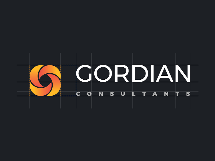
The inspiration of the logo comes from the initial letter of the company (G) and its round character. We used 4 rounded repeating shapes in a continuous and infinite approach to depict the Godrian Bond. The feeling of the logo combines both the effective solutions provide by Gordian Consultants as long as the strong relations with its clients.
A gradient orange texture has been used to promote the dynamic character, achieve the continuity and create a memorable identity that stand both in white and black backgrounds.
