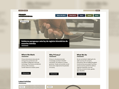
Privacy International Refresh
Over the last three years I've regularly worked with Privacy International but they approached me before Christmas for a complete redesign of their website.
PI are a challenging client because as they're a privacy non-profit, I have a lot more constraints when I work with them compared to other clients. When designing and theming a website, I can't use any PHP or any templating language such as Twig, I can only use CSS and very minimal Javascript. I also can't easily change the markup so I have to design with the markup supplied from Drupal.
The previous iteration allowed the staff to tag a piece of content as a blog, or news article for example and the page was automatically coloured so the user knew which section they were in. However, for this refresh they wanted to share the content more and instead tag it with themes such as AI or Biometrics. This meant the site needed to be more muted in its colour scheme so we went from 12+ colours to 5. We kept the same typography styles from the previous design and I'm really pleased we managed to create something fresh but still familiar for the PI users.


