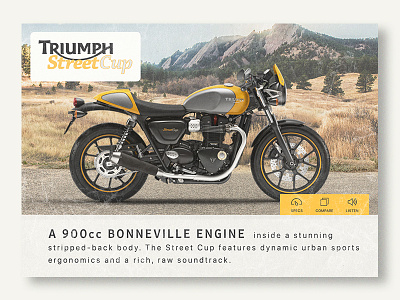
Thirty UI #2 - Motorcycle Product Card
My second shot from the Thirty UI challenge. Apologies for the huge delay.
The challenge here was to make a product card for a motorcycle. I went off task a bit and picked a different bike to mix things up for myself and for you all.
I have this vision of an entire Triumph site in this faux weathered style. This is a first step - layout inspired by the old Triumph print ads.
Check the attachment for a bigger file. Comments welcome as always. Thanks!
More by Matt Habina View profile
Like

