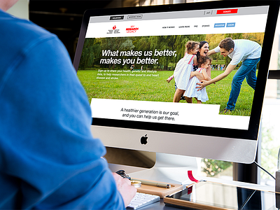
American Heart Association Landing Page redesign
This redesign of AHA's landing page was meant to do a better job at explaining the My Research Legacy cause, engage the audience more efficiently and persuade the audience to sign up - providing their medical history. The original landing page had a few UX and UI mistakes and was not up to standards.
I assessed the current page, mind mapped what could be changed / added and then I wireframe out a desktop and mobile update. Here shows the before and after landing page and a snippet of the mobile version. I tried to incorporate more emotional provoking quotes and imagery, as well as a better flow for users to follow and more areas for users to control their experience; chasing their font size at the top, bringing more into view the CTA's and actions like a chat box for questions.


