Poster detail
One of my cousins asked me to do her a favour last week: create a small poster (A4 format) that will be displayed at a shelter for refugees in Paris.
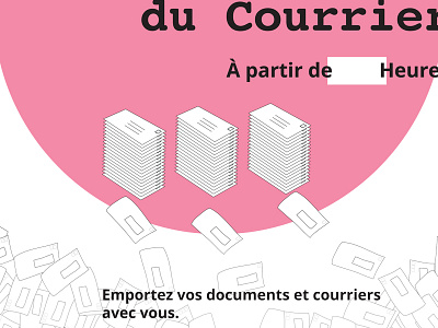
The poster needed to convey a workshop for mail sorting and classification. As for any of poster design, the message needs to be clear and striking. My cousin suggested to have some mail in a mess and some tidy. She gave me "carte blanche" to create the poster.
Since it had to be quick, I reused some illustration style idea I had already explored for a client project before. A lot of letters are displayed at random at the bottom of the poster and they turned into 3 piles of clean and tidy mail. The whole concept is reinforced by the use of the Courier Bold font. Some white spaces were left to write the time and date by hand — a request from the "client". The copy was simplified in shorter and more direct sentences so that it could be understood easily (target audience). The message can also be read from far away.