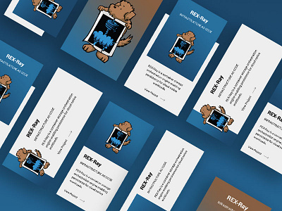
Options for Project Card Design
We explored a few options when designing the project cards for the open source projects page on the {code} site.
We started off with a few pieces of required information and went from there. Keeping interactions in mind (how it would animate on hover), the chosen option was described by the users as the cleanest design, easiest to read, and most efficient for space/responsive.
Take a look at the attachment to see all the options in detail. Option 3 is what was chosen. What do you think?
Hit the L to show some digital love!
---------------------
Click around: thecodeteam.co/projects
Follow the Fullstack Digital team on Dribbble & Instagram
More by Light Creative View profile
Like

