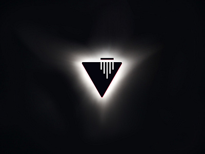
Voyager Foundation dynamic logo - eclipse visual
Was was the main feature of VF core visual language? One of them: we resulted with a dynamic logo - “container” type - that turned to be used as we want. In within brand guide I created 32 logo-adaptation variants. In branding it is called high-level mimicry - where logo is not containing contents inside, but also “turns into” objects in order to fit environment and match content organically.
One of them - eclipse - on the shot.
Second - neons - on the meetup cover: https://www.facebook.com/events/325438377982642/
Primary color - black, no other color version.
_
My personal creator’s impression: I have never had such fun designing dynamic identities. Logo shape that can easily took visual appearance of crystal prism, eclipse, glass installation, neons, set of nodes, hologram, spaceship and all possible color combinations depending on graphic environment… Dream project, what else to say!
