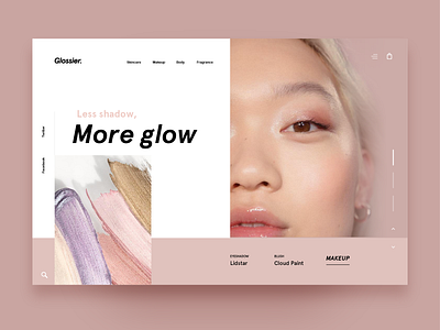
Glossier Homepage
I thought I would try something a little different today! I'm loving the minimalistic, broken grid trend lately. I think this style would fit perfectly with Glossier's branding, so I decided to mock up a Glossier webpage just for fun. Let me know what you think!
Check out what I'm posting on my other socials:
Youtube: https://www.youtube.com/channel/UCAncP7gtfX40MQGLYHEhpkg
Twitter: https://twitter.com/andreahock0
Instagram: https://www.instagram.com/andrea.hock/
Behance: https://www.behance.net/AndreaHock
Medium: https://medium.com/@andreahock0
More by Andrea Eppy View profile
Like

