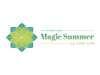
The Wrap Show Magic Summer original idea
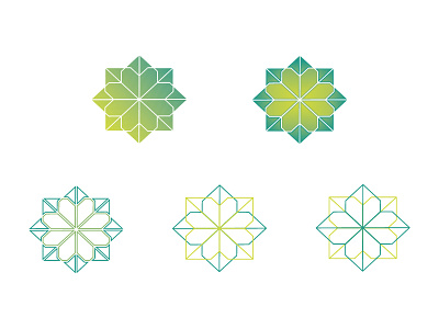
This was the first completed concept I created; I used typography from the original brand and opted for fills as well as strokes on the mark.
As much as I loved the gradient fill and subtle stroke, Melissa felt it was a step too far away from the original logo. She also felt the typography wasn't funky and carefree enough. She wanted something less professional for this event as it will have a much more relaxed setting.
More by Katherine Cory View profile
Like

