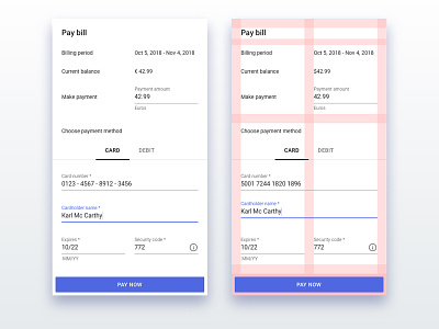
Payment Dialog
During a design discussion at work, we discussed an existing interface design for payments. For fun, I decided to create my own version. My version is based on the existing design.
Some key design points:
The design is based on Material Design.
All unnecessary UI elements were removed.
The layout is specifically structured to guide the user as follows:
1. Primary information first - (Bill status).
2. Secondary information, payment method - (User’s choice).
3. Prominent, full-width, call-to-action - (making it as easy as possible for a user to perform task).
Connect with me, say hi and check out more of my work:
Instagram | LinkedIn | Facebook | Twitter
karl_mc_carthy_-_payment_dialog.sketch
300 KB
More by Karl Mc Carthy View profile
Like

