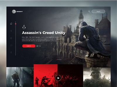
Ubisoft Landing page Concept
UBISOFT Concept design. Mainly in dark colors. Red is used as a hint for the color of information. Emphasize information.
Feel free to give feedback.
Thankyou!!!
More by prashanthraghu View profile
Like
