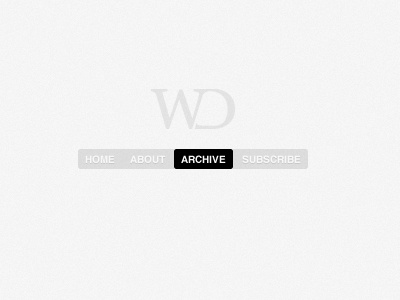
Simple Nav
I've been working on a redesign for my (temporarily shutdown) blog and have been stuck in a rut for a while. Just recently have I been able to sit down and really focus on the design and the direction I want to take my blog.
This is a little navigation I created for the blog. In writing this little comment I realize the balance of it is bothering me. The shorter length word on the left to a longer length word on the right. I'm thinking I should change the last two. Maybe "Posts" instead of "Archive" and "Feed" instead of "Subscribe"?
What say you?
Side Note: Logo was designed by a good friend of mine Kevin Richardson. Check out his stuff: