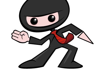
Ninja 1
A little logo/mascot I'm working on for a web app. I'm liking the simple, angular style but now I'm thinking the hand I've finished might need to be simpler to match the lower level of detail in the rest of the drawing. Hmmm. Thoughts?
More by Jared Christensen View profile
Like
