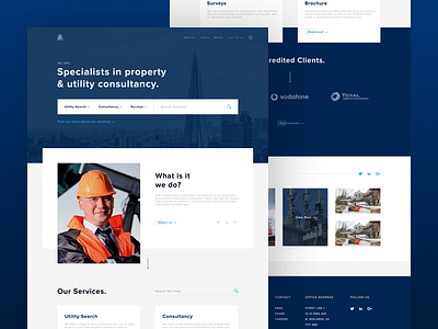
Property & Utility Landing
Here is a WIP for a client I'm working with as part of our university module this year. They've asked that I don't show the name of the company or reveal the logo yet as there's still more work to be done, however they are a property and utility consultancy based in the UK.
They offer a lot of services and consultancy needs, therefore establishing a good UX flow was key to making sure the site can be easily navigated and all of the content easily found. This was planned before any design work began, the first idea being the establishing filter menu on the hero that I went with.
Hope you like - check out the attachment to see the full page concept as it is now! :D
Hero Image Credited to Jamie Street / Unsplash
More by Curtis Lee View profile
Like

