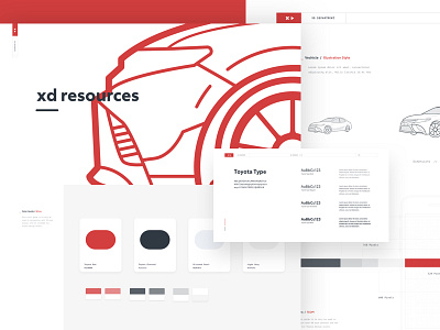
Wireframe Style Guide & Illustrations
One of the projects I worked on with the amazing Saatchi and Saatchi team was to create a new look and feel for future Toyota digital wireframing needs. Our goal was to create a light UX kit that bled personalty, something that was not only functional but still human, ultimately we wanted our wires not to look like wires but still look like wires.... confused yet...good.
I think it's just as important to present quality work to a client no matter what the deliverable is, while standard wireframes get the job done they don't necessarily get the job done in an elegant way. Most designers and UX gurus understand what the grey boxes mean however we found it involved additional explanation to the client ultimately leading to spiral conversations and lost time.
This exercise was interesting in the aspect that I was designing light elements that would eventually be used to quickly wire up future experiences.
Time Suck : Car Illustrations.


