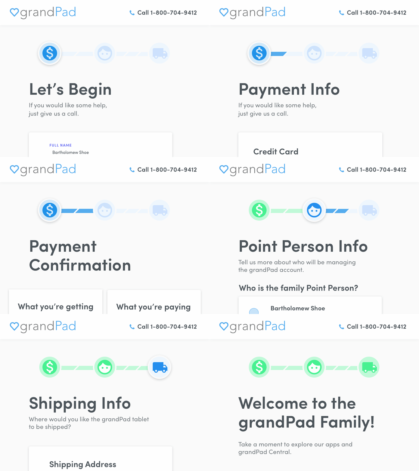
GrandPad Checkout Details - Progress Bar
Who knew a little bar could go so far?
When redesigning the GrandPad buy flow, one of the biggest user complaints from the old version was that the process was just too long. We have to collect info on multiple people to set up a GrandPad account.
I did my best to shorten the process by removing unnecessary information gathering and allowing the users to populate data from previous inputs, but one of the biggest impacts on perceived checkout length seemed to be the progress indicator bar I put at the top of each page. Providing the users with a simple indication of where they are in the process of the flow provided some reassurance of their progress and some trust in the company.
Little details go a long way 🙌
More by James Lyons View profile
Like
