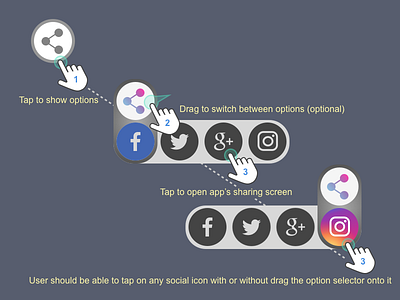
10. Social Share
Lessons learned: I started this drawing with step 2, as I had an idea of a conveyor belt. I then started to fill in step 1 and 3. Just when I was so excited about the whole design, I found myself didn't think it through. If a user already sees all the options, why they don't just click on one of them? The step 2 is totally unnecessary and add extra burdens to users. However, it does provide visual clarity about the current option. I think I need to bear this in mind "Form serves function". I am posting it anyway, to remind myself in the future!
More by Xuan Luo View profile
Like
