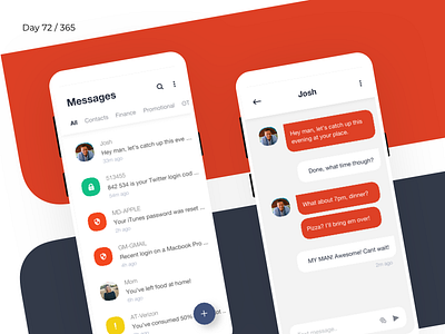
Android Messages - Redesign Concept | Day 72/365 - Project365
Day 72/365 - Android Messages - Redesign Concept
Redesign Tuesday:
For Redesign Tuesdays, I usually would incline to redesign interfaces that I have been using regularly.
Today's take is on Android Messaging!
Android Messages have been a mess ever since Google introduced Material Design. On top of that, they have 4 different apps for Messaging, which is all over the place!
You still can't view messages by filter, categories, sort messages, view them on the web like iMessage etc!
Here's my take on Android's Messaging platform; I've not made a functional overhaul, but a few aesthetic changes and the introduction of categorizing messages based on its content.
Since Android can pretty much do anything with ML/AI, Why not messaging! It can give you smart replies, but can't sort messages by its type?
My concept does this, it can recognize the type of message, categorize it and show it to you in a neat manner. You can choose to ignore categories, move them to Bin with filters, archive them on arrival, add smart replies when you're driving etc!
Let me know your take on this!
What is Project365?
Visit Project365.design

