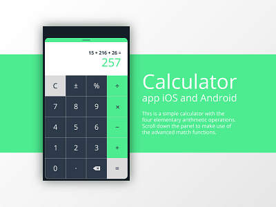
Daily UI Challenge #004 - Calculator
This challenge was a lot of fun! It may look easy to design the user interface of a calculator, but the task also required to put attention of every detail. A calculator must be simple to use, so I played a lot with colors. Green and grey are able to recall the idea of modern and digital, and I used them to visually suggest where the most important keys are located, like the four elementary arithmetic operations. On the top we have bar that's just asking to be scrolled down to show some more advanced operations. Simple yet effective, isn't it?
Text and Copywriting, both in projects and in descriptions, is written by Ivan Cunzolo.
🎨 Press "L" if you like it or leave a comment, thanks! 😄
More by Annalisa Roberta D'Onofrio View profile
Like
