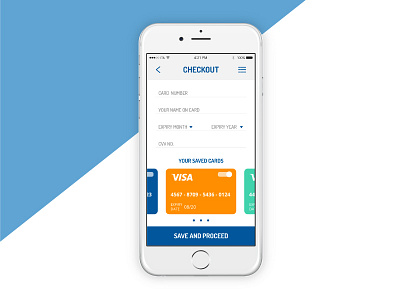
Daily UI Challenge #002 - Checkout
Today's challenge was to project an interface for online payments, and it was very interesting! The goal is to give the user a simple and intuitive interface, so he feels safer and more trustful towards the brand. The hardest challenge was to give two choices in a single screen: both the possibility to insert a new credit card, and to use a card that had been already inserted before. The style is fresh and modern, colors like blue and gray help to communicate trust and innovation.
Text and Copywriting, both in projects and in descriptions, is written by Ivan Cunzolo.
🎨 Press "L" if you like it or leave a comment, thanks! 😄
More by Annalisa Roberta D'Onofrio View profile
Like
