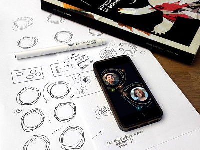
Jolocom new visual language - sketches
It’s SXSW happening now in Austin.
(from their official program): “Shark Tank: Best of Berlin Startups. … Berlin will bring the following 8 creative start-ups under the roof of Start Alliance to Austin: …”
Yesterday my company - jolocom.com - stepped to “Best of Berlin” stage at SXSW with a new visual look. On the shot: WIP of my first lean branding sprint with a new team.
It was two-weeks sprint with full-volume personality workshop, market research, few presentations, instant feedback and every-day voting.
The greatest outcome is the visual design direction we choose.
After me presenting the current state of visual design in blockchain industry (a very sad situation out there, btw), the team decided: “No common blockchain graphics, no isometric illustrations, no electric blue-purple colors. We are going to be human brand!”
On SXSW we went with pitch deck and social media updates as pilot-assets of our new visual language - high-tech, dark, but human.
