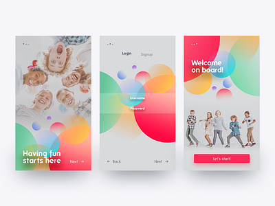
Onboarding for a kids' app
Today I have something unusual.
I love me some monochrome white/black/high contrast design and I'm not very fond of the over usage of gradients. But there are instances that definitely calls for a good gradient.
Here's a fun piece with lots of colors and gradients.
What do you think? Kids would like it? :)
More by Bettina Szekany View profile
Like

