Buy and Sell Messages
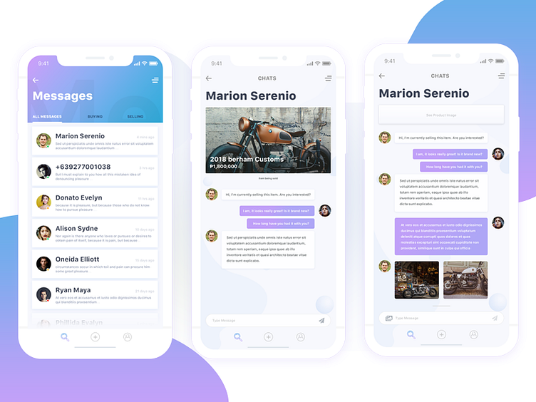
Here is part 3 of my Buy and Sell UI/UX project. This time, the messaging pages, where users will try to contact and talk to the seller about the product that they are selling.
At the start of the conversation, the product image is shown at the top of the conversation. The more messages made, the product image will be replaced by a stickied button, at the top where users can click on it to see the product image again.
You can check the full screen at my portfolio: https://marionserenio.com/buy-and-sell-iphone-app-wip-3/
More by Peter Garcia View profile
Like
