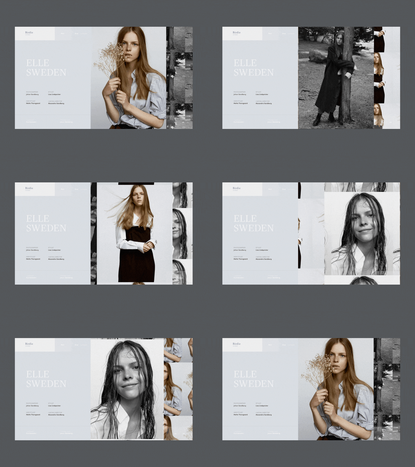
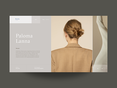
Birdie Fashion Store Blog Inner Page Animation
Glad to share with you my new shot on the fashion e-commerce Birdie project. Today, this is an animated version of the article inner page.
My general objective with the design was to play with the geometry of layout, broken grid and whitespace. The animation was created respectively to support the overall look and feel.
I think it came out pretty stylish. Eager to hear your feedback!
Have a great week :)
Cheers!
Press "L" to appreciate it
More by Synchronized View profile
Like

