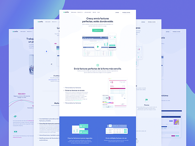
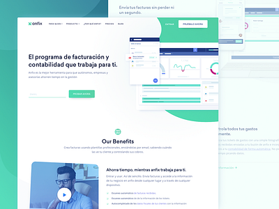
Feature Pages Design for Invoicing SaaS Company
Happy Monday!
What you see above are the pages we designed here at Zajno that represent different features of Anfix, a Spanish invoicing and bookkeeping software company that provides multiple services from account management to financial control of the entire business and allows automating the whole process, saving your time and money and making it all quite simple and transparent.
You can find the live version of the pages by clicking the ‘Producto’ button on the website.
Goals
Creating a new modern website that would solve the clients’ business problems attracting more leads and converting them into customers.
Approach
We jumped at crafting effective needs statements after visiting and talking to our clients. We discussed their target audience, created their use cases, and based our structure off of that. The key objective was to show the main advantages of using Anfix software to encourage potential clients to learn more about the product and eventually click the Free Trial button. That’s why we chose to use minimalistic and simple UI to present the data in the easiest way.
Results
We ended up with a clean, modern and pretty nice-looking design with good white space utilization and attention to detail that allow attracting the target audience in a more efficient way.
You can check out the live version here!
Eager to hear from you! Drop us a line ;)
Press "L" to show some love!
Don’t forget to follow Zajno on social media and feel free to drop us a line:
Facebook | UpLabs | Twitter | Instagram | Zajno | Medium


