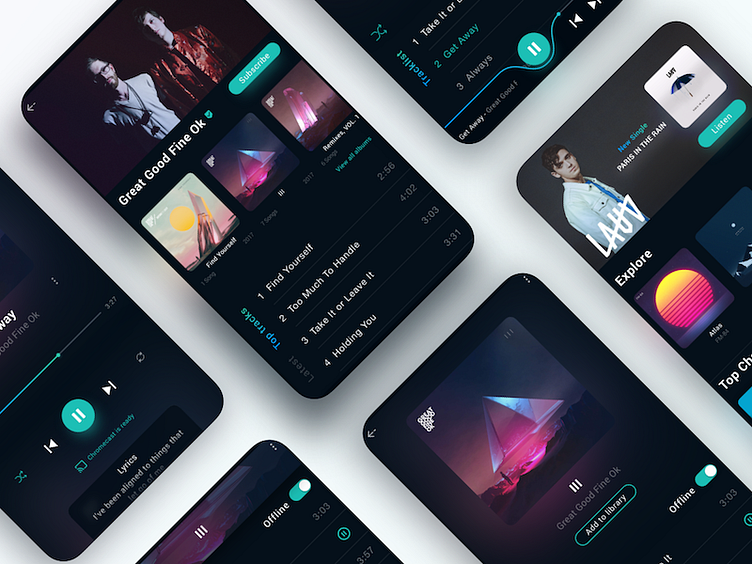
Spotify App Concept Interface Reloaded
Redid the layouts for the preview, also added a new "Explore" page.
Things I wanted Spotify to change/have: 1. Lyrics display is disastrous and annoying to swipe 2. Missing featured section on the "Home" screen, instead there is only "Daily Mix" which can also be found in "Radio", it's a repetition 3. placing the pause/play button on the right side it's not very comfortable to reach if you are holding the phone with your left hand
More by Carlos Han View profile
Like

