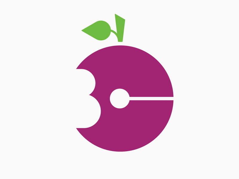
Logo concept (read description)
I'm in the middle of a really fun logo project for a health coach who helps clients transition into a healthier diet. I can't share more about it at this time… but her company name is two words… the first word starts with a "C", the second word starts with a "B".
She loved this concept during the initial presentation, but after receiving some negative feedback now feels it's too similar to the Apple Inc. logo.
I'm looking for honest feedback here. Are the Apple Inc. logo comparisons valid and should she be concerned about it? I'm firmly in the "no" camp, but I'm curious how other creatives feel.
Thanks in advance.
More by Projekt, Inc. View profile
Like
