sjia mobile pages 2
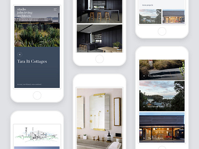
Mobile was, of course, a high priority. John was adamant that navigation and content hierarchy left no room for confusion on small devices. We pivoted the mobile version of the home page towards greater navigational functionality and finessed the longer content pages into rhythms that read well even when the horizontal variation from larger screens is omitted. Always while maintaining the minimal brand elements of border and colour that make each screen uniquely theirs.
New work from 2017 up in my portfolio!
See the whole case study: http://benek.nz/work/studio-john-irving-architects
Visit the website: http://studiojohnirving.com/
----
Need a design partner for your next big project? Contact me at benek.nz
Follow me | Website | Behance | Pinterest | LinkedIn | Twitter