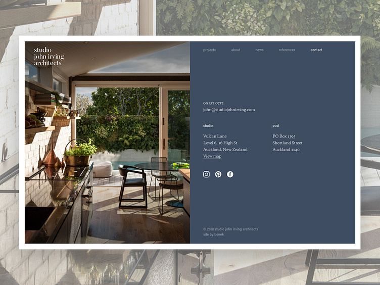
sjia minimal content pages
The simplest content pages were an exercise in minimalism and gave us an opportunity to double-down on some of the SJIA brand's distinguishing features of layout, type, imagery, and bold colour. Even the smallest pages were given the love and attention they deserve to make sure the whole digital experience nourishes the brand. Subtle touches of logo animation and screen transition add to a smooth, polished interactive experience that we hope remains memorable for SJIA's current a future clients and colleagues.
New work from 2017 up in my portfolio!
See the whole case study: http://benek.nz/work/studio-john-irving-architects
Visit the website: http://studiojohnirving.com/
----
Need a design partner for your next big project? Contact me at benek.nz
Follow me | Website | Behance | Pinterest | LinkedIn | Twitter
