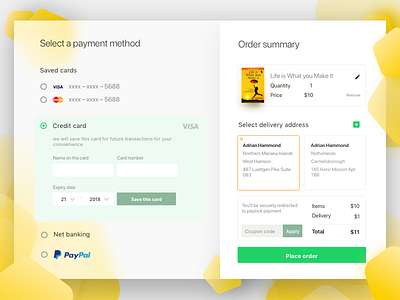
Payment UI for Checkout
Here's a clean and minimal approach to the payment ui for the check out page .Breaking down to several steps is good option but relevent data related to bought item should be in the same screen, it creates a sense of trust and secureness to users .Hope you dig this.... :)
Follow my work:
Dribbble
Behance
More by Ankit Guleria View profile
Like

