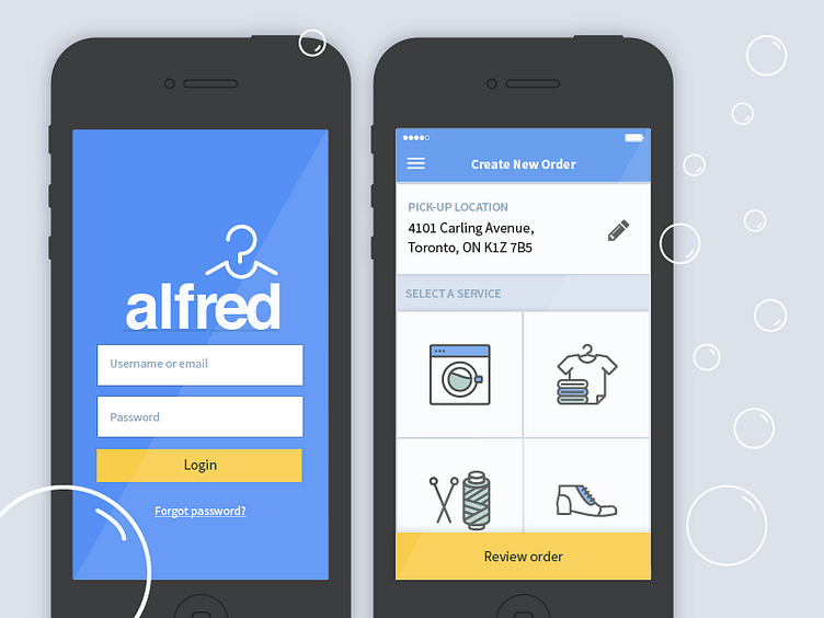
Alfred Toronto visual design
Here is my second exploration on the Alfred Toronto app UI design. My main goal is to strike a balance between representing an app for laundry services, versus the sleek and hip neighbourhood in which it is situated.
One of my first steps was to pull the app away from its turquoise colour scheme and into the richer blues. This modernizes the look of the app. I also eliminated the round corners of the components and gave the details sharper, cleaner lines.
Additionally, I've filled in the images with iconography that best represent each service. These icons were taken from https://thenounproject.com/
Credits include:
Washer icon, "Laundry" - Makarenko Andrey (https://thenounproject.com/search/?q=Laundry&i=1304053)
Folded clothes, "Laundry" - Surangkana Jomjunyong https://thenounproject.com/search/?q=Laundry&i=1570686
Thread and needle, "Sewing Thread" - Ben Davis https://thenounproject.com/search/?q=Sewing&i=574495
Shoe, "Boot" - Chameleon Design https://thenounproject.com/Chamedesign/collection/cloths-and-shoes/?i=230643
