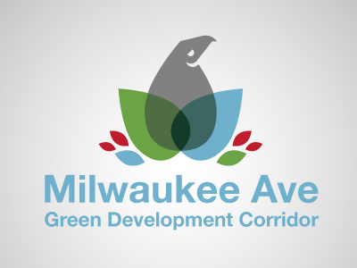
Milwaukee Ave Green Dev Corridor Logo
My neighborhood was holding a contest to create a new Logo for a green development project that would effect a number of the business's & residents along a certain stretch of the road.
This here was one of my submissions for this project. The Eagle is the centerpiece of our neighborhood & wanted to re-envision it incorporating the symbols of a leaf & water droplet creating a harmony that symbolized all the elements working as one. Helvetica was chosen because it is the typeface of most of Chicago's signage & I wanted to it to live along side all of these other elements.
Any feedback you have would be great!
You can vote for it here: http://www.surveymonkey.com/s/JHQPX77
More by Andrew Thompson View profile
Like
