About Page Design for New Website
Yo!
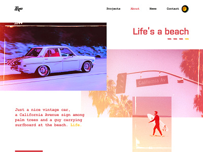
We’re excited to show you a new ‘About’ page design we created here at Zajno for our new website! We’re currently trying to choose the best design solution for our website among numerous ideas, the one that would reflect our spirit, you know. What you see above is one of the solutions we came up with.
Goals Tell our story and reflect our spirit with the help of design. We want our future website visitors to capture the mood of our crew, to feel the right emotion. We want the kind of design that speaks, that shows who we are and gives the right vibes.
Approach As our objective was to create the right mood, we decided to do that showing you the landscapes we see every day hanging out in LA, the scenery that serves us as a source of inspiration. The ‘Contact’ button goes together with the button we all push most often - the ‘Walk’ button pinned to the traffic lights pole. Thought it would work well as a CTA element. The four little bars you see under ‘Life’s a beach’ represent the slider that allows showing different sections of the page including the info on the team, our approach, motto and other stuff blended with more images. The slides will change with nice smooth transitions.
Results We ended up with a pretty original and storytelling design that, hopefully, gives the right feel and emotion. We do look forward to hearing what you guys think of this! Let us know if you felt those vibes :)
Press "L" to show some love!
ᗈ Join our Newsletter! ᗈ Website ᗈ TheGrid ᗈ Spotify ᗈ Twitter ᗈ Medium ᗈ Facebook ᗈ Instagram

