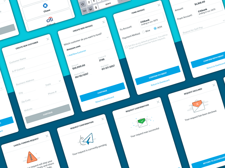
Modal Madness
Modals for days! Our platform processes a lot of transactions in both directions (incoming and outgoing), so there are a lot of confirmation screens in place to make sure money goes to the right place (which is trickier still when multiple stakeholders/business owners are involved), in addition to the standard screens dealing with general account activity and compliance notifications.
As such, we needed to build a system of communication that made the most sense and played nice with a pretty daunting set of constraints, with the most challenging being:
1) The system must support multiple forms of communication (ie: text, images, functions/interactions).
2) The system must be able to display a wide variety of tabular data (ie: from simple customer info to complex amortization tables).
3) The system, when exited, must take the user back to their original place before it was triggered (which pretty much eliminated opening a new page within the same window).
And so on... what we came up with is a maze of modals and a system of patterns to accompany it—which work just as well on web as it does on mobile, are flexible and lightweight, and designed to scale.
