Sonos Concept UI
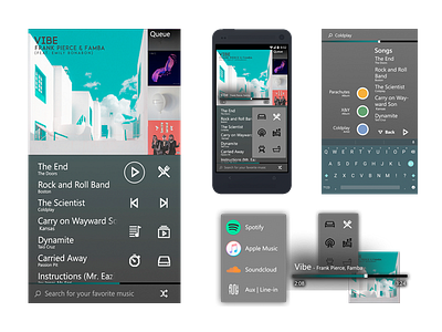
Does the Sonos app bug you like it bugs me? This is a concept UI for Sonos (or a similar app) where a room needs to be selected, along with the music that's playing, and what the source of that music is. I integrated playback, location, and source controls into one screen, while they are separated into multiple in the Sonos app.
This concept also allows a user to play a recently played playlist with one tap upon opening the app. Spotify's app, which inspired the visual motifs present in my design, requires at least four taps to play a recent playlist, while the Sonos app requires this many taps just to select a room. This concept allows for room selection and source selection in two taps so you can get back to jamming out!
The playback buttons are on the right-middle of the screen to allow for optimal access by a right-handed user interacting with their thumb. The play/pause button is the most commonly-used button, so it is placed where the thumb naturally rests when holding a device with one hand. The queue, which would be draggable and editable in a release version, is also closeby, along with the other most important playback controls. The upper left hand side of the screen however, which is out of reach of a right-handed thumb-user, displays the album cover of the song playing, which requires no touch interactions. This lateralized approach yields huge efficiency increases for the user, and the layout could be reversed in-app for left-handed users.
Play with the InVision prototype on mobile to see the potential for yourself! https://projects.invisionapp.com/m/share/NKFYKZLRDY9
See it in action in this GIF:
https://dribbble.com/shots/4324961-Sonos-Concept-UI-GIF
Tell me what you think!
